Ugly on Purpose: The Gen Z Web Designers Who Think Clean Is Boring
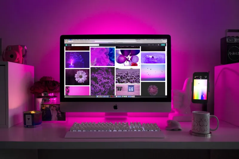
Open almost any major website right now and you'll see the same thing: rounded corners, pastel gradients, a sans-serif font that costs more than your rent, and a hero image of someone laughing at a salad. It's clean. It's optimized. It loads in under two seconds and tells you absolutely nothing about who made it.
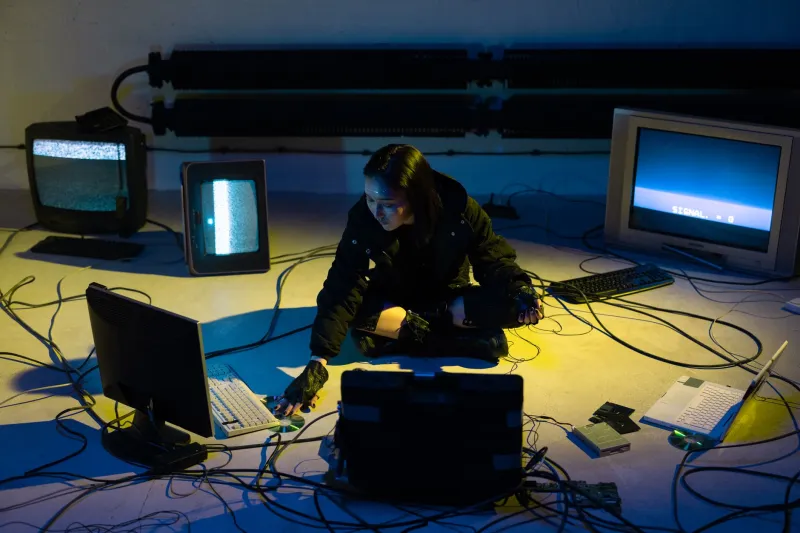
Now open one of the personal sites coming out of the brutalist web design community and brace yourself. Overlapping text. Scrolling marquees. Backgrounds that make your eyes vibrate. Navigation that seems designed specifically to confuse you. And somehow — somehow — it feels more alive than anything a $40,000 branding agency could produce.
This is the aesthetic rebellion nobody in Silicon Valley wants to talk about, and Gen Z is absolutely running with it.
The Algorithm Made Everything the Same
To understand why young creators are going out of their way to build deliberately ugly websites, you have to understand what they're reacting against.
Platform design has spent the last decade converging on a single visual language. Instagram, TikTok, Spotify, even your bank's app — they all speak the same dialect. Smooth. Frictionless. Optimized for engagement metrics that nobody outside a boardroom actually cares about. Every color choice, every button radius, every micro-animation has been A/B tested into submission until it produces the maximum number of clicks from the maximum number of people.
The result is a digital world that feels like a shopping mall designed by committee. Functional, sure. But utterly devoid of personality.
"When everything is optimized, nothing is authentic," wrote one user on a popular web design forum earlier this year, kicking off a thread that spiraled into hundreds of replies. People are hungry for something that doesn't feel like it was built to extract value from them.
What Brutalism Actually Means Here
The term "brutalism" in web design borrows loosely from the architectural movement of the '60s and '70s — raw concrete, exposed structure, zero decorative pretense. Applied to websites, it means rejecting the invisible hand of UX best practices and letting the seams show.
But the version Gen Z is running with goes further than just ugly-for-ugly's-sake. These aren't people who don't know how to use Figma. Many of them are formally trained designers, developers who could build a pixel-perfect landing page in their sleep. The chaos is intentional. The clashing colors are a choice. The broken grid is the point.
Some of the most talked-about personal sites in this space look like they were assembled by someone who learned HTML from a 1998 tutorial and then had a philosophical crisis halfway through. There are sites with cursor trails, sites where the text literally runs off the edge of the screen, sites where you have to click through five confusing pages just to find someone's email address. And people are bookmarking these things. Sharing them. Writing about them.
Because they feel like they were made by a person.
The Neocities Renaissance Nobody Expected
If you want to see this movement in action, spend an afternoon on Neocities — a free web hosting platform that's essentially a spiritual successor to GeoCities. What started as a nostalgia project has quietly become one of the more interesting creative communities on the internet.
The site hosts tens of thousands of personal pages, and the ones getting attention lately aren't trying to look professional. They're shrines. Scrapbooks. Digital bedrooms stuffed with GIFs, bad poetry, obsessive fan pages for obscure media, and personal essays written in fonts that technically exist but probably shouldn't.
It's the kind of web that existed before social media flattened everyone's identity into a profile grid. And for a generation that grew up entirely inside those flattened spaces, it apparently hits like a revelation.
One creator, who runs a Neocities page dedicated to her collection of weird vintage ceramics and her thoughts on regional fast food chains, described the experience of building it as "the first time the internet felt like mine." She has no follower count. No engagement rate. Just a page that looks exactly how she wants it to look, visited by people who actually sought it out.
Corporate Aesthetics as a Form of Control
There's a more pointed critique underneath all the blinking text and terrible color palettes. A lot of the people building these sites are consciously pushing back against what they see as the aestheticization of corporate control.
When every platform looks the same, you start to move through digital space the same way. You consume the same. You present yourself the same. The visual language of modern tech isn't neutral — it's designed to make you feel comfortable enough to keep scrolling and just uncomfortable enough to keep seeking the next dopamine hit.
Deliberately ugly websites break that spell. They ask something of you. They don't guide you smoothly toward a conversion funnel because there is no conversion funnel. They might not even work properly on mobile. And that friction, that small moment of confusion or delight or mild irritation, is increasingly being understood as a feature rather than a bug.
Some designers in this space talk about "earned weirdness" — the idea that a site that looks strange has actually communicated something real about its creator before you've read a single word. Compare that to a beautifully templated portfolio site that tells you exactly nothing except that the person who built it knows which Squarespace plan to subscribe to.
Not Just Nostalgia
It would be easy to dismiss all of this as nostalgia — Gen Z romanticizing a version of the internet they never actually lived through. And sure, there's some of that. The Y2K aesthetic wave, the obsession with early-2000s web culture, the ironic appreciation for Flash games and forum signatures — all of that plays a role.
But the brutalist web movement is doing something different from pure nostalgia. It's not trying to recreate the past. It's using the aesthetic vocabulary of the early web to build something that the early web couldn't have imagined: a deliberate, politically-aware rejection of the polished present.
These creators know what a good website looks like. They're choosing not to make one. That's a fundamentally different act than just not knowing better.
The Weird Will Survive
Here at Zixia, we've always believed that the weird stuff outlasts the optimized stuff. Algorithms flatten. Trends normalize. But genuine strangeness — the kind that comes from a real person making real choices that reflect who they actually are — that has staying power.
The deliberately ugly website movement is, at its core, a bet that authenticity will always be more interesting than polish. That a digital space which feels alive — even if it's technically broken, even if it assaults your color receptors — is worth more than one that functions perfectly and means absolutely nothing.
Somewhere out there, someone is publishing a personal website with a tiled background of their cat, a MIDI file that plays automatically, and a guestbook. And honestly? We kind of want to sign it.